As I was walking to work recently, I couldn't help noticing the following workplace safety advertisement on a bus stop shelter (I have a peculiar habit of noticing outdoor advertisements of all shapes and sizes):
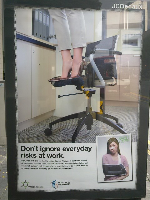
Put up by the Ministry of Manpower's Workplace Safety and Health unit, the poster had a simple and succinct message reminding everybody to be careful and to take care of themselves. This is important as some 29 per cent or 3,000 workplace injuries last year were from non-factory industries like retail, entertainment and services.
While the advertisement did work (at least for me) with its straightforward message and clear visuals, I couldn't help noticing how alike (yet different) it was compared to a similar campaign last year in Melbourne put together by Worksafe Victoria.
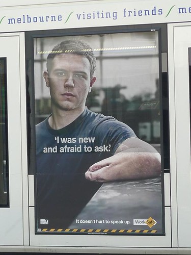
Back then, I blogged that shocking visuals could be a way to get a message across in a cluttered advertising scene. Of course, the Victorian government took a more graphic approach to safety at work.
Which approach would work better for you and why?Labels: advertising strategy, melbourne, ministry of manpower, outdoor advertising, Singapore, victoria state, workplace safety